
Search for a Shopify masonry gallery or a Shopify image carousel app and you will find plenty of both, but little help deciding which one a page actually needs. Grid vs masonry is not a matter of taste alone: it depends on whether your photos share proportions, how many there are, whether shoppers need to scan or to browse, and how much vertical space the page can afford. This guide goes through the nine layouts in Snug Gallery, when each one fits, and the settings that matter for each, so you can pick a layout for a page in a minute and change your mind later without rebuilding anything.
The problem: one layout for every page
Most gallery tools start with a grid and grow from there, and for years some offered little else. Among the older one- and two-star reviews on Cozy Image Gallery's review page is one from 11 January 2020 calling the app “very expensive for lack of customization options such as having no photo carousel”; the developer's reply on the same page is worth reading for their side. The app has changed since and remains listed, so treat the quote as a dated illustration, not a description of the app today.
The underlying point still holds. A store rarely has one kind of gallery. The home page wants something compact that leads to products; the about page wants large editorial images with room for a story; a portfolio or press page wants many images, filterable; a product-launch page wants a strip that moves. Forcing all of those into a grid produces pages that are either too long or too cramped.
Why layout is a page decision, not a gallery decision
In Snug Gallery the layout is chosen per gallery in the editor, while everything about how the block looks on a page (columns per breakpoint, spacing, image shape, captions, hover effect, lightbox, filter bar) is set on the block in the theme editor. That split matters because the same set of photos can appear as a three-column masonry wall on the lookbook page and as a two-per-view carousel on the home page: create two galleries from the same files, or place one gallery in two blocks with different settings. Shopify's theme editor previews the block against your actual theme as you change settings, so decisions are visual rather than theoretical.
The other constraint is proportions. Layouts that crop images to a shape (grid, collage, portfolio, slider) make mixed portrait and landscape photos look uniform at the cost of trimming edges. Layouts that keep original proportions (masonry, row, list, lookbook) show the whole photo and let the composition breathe, at the cost of a less regular silhouette. Knowing which of the two your photos need answers half of the layout question.
Grid vs masonry
Grid places images in even columns and crops each one to the Image shape you pick: square, 4:3, 3:4, 16:9 or original. It is the right choice when the photos are product shots on a consistent background, when the page needs to look orderly, or when captions below each tile should line up. Three or four columns on desktop and two on tablet is the usual starting point; on phones you can choose one or two.
Masonry keeps every image's original proportions and packs them into columns without gaps, so a tall portrait sits next to two landscapes and nothing is cropped. It ignores Image shape entirely. It suits photography that varies in orientation, customer photos, and any page where the images are the content rather than a route to a product. The trade-off is a ragged bottom edge and a page that gets long quickly; more columns and a smaller gap keep it dense.
Row is the third member of this family, for a single justified line of images: they share one height and fill the width exactly, so a strip of five photos looks like a contact sheet. It works well as a divider between sections on a home page. On phones it stacks or goes two per row according to the mobile column setting.
Carousel and slider: when the gallery should move
A Shopify image carousel app is really two different things, and Snug ships both. Carousel shows several images per view, using the same column settings as the grid, and scrolls horizontally with arrows. It is for a set of related photos that should not take over the page: a home-page strip of lookbook shots, a row of press images, thumbnails leading into a collection.
Slider shows one full-width image at a time, with arrows, dot indicators, keyboard arrows and touch swipe. Autoplay and the seconds per image are block settings; autoplay pauses on hover and is skipped for visitors who have asked their device for reduced motion. Height follows Image shape, and with Original every slide is letterboxed to the tallest image's proportions, capped at 80% of the viewport height, so a mixed set does not jump around as it advances. Use a slider for a hero or campaign section with a handful of strong images; more than eight or so and visitors stop advancing.
Collage, portfolio, list and lookbook
Collage lays images on the column grid in a repeating pattern: every third image becomes a 2x2 tile, alternating left and right, and the rest are single tiles cropped to the Image shape (Original behaves as square). It gives a magazine feel with no manual arrangement and shrinks the grid for small galleries so that even three or four images fill the width. Captions set to Below image are shown as an overlay so the tiles stay aligned.
Portfolio is a grid of even tiles with the caption title overlaid and a tag filter bar above it, on by default. Tag each image in the editor (Riders, Gear, Peaks) and visitors get pill buttons that filter without a reload; a filter can also be linked to directly. It is the layout for a large body of work that people need to narrow down: a photographer's portfolio, a case-study index, an installations page.
List stacks full-width images vertically with the caption beside each on desktop, optionally alternating sides, and below it on phones. It is closest to a long-form article and suits an about page or a process story where every image needs a paragraph.
Lookbook puts one large editorial image per row with its caption and any pinned products in a text column beside it. It exists for Shop the look: pin products onto the photo in the editor and shoppers get a product card that adds to the cart without leaving the page. The full workflow is in How to make a shoppable lookbook on Shopify.
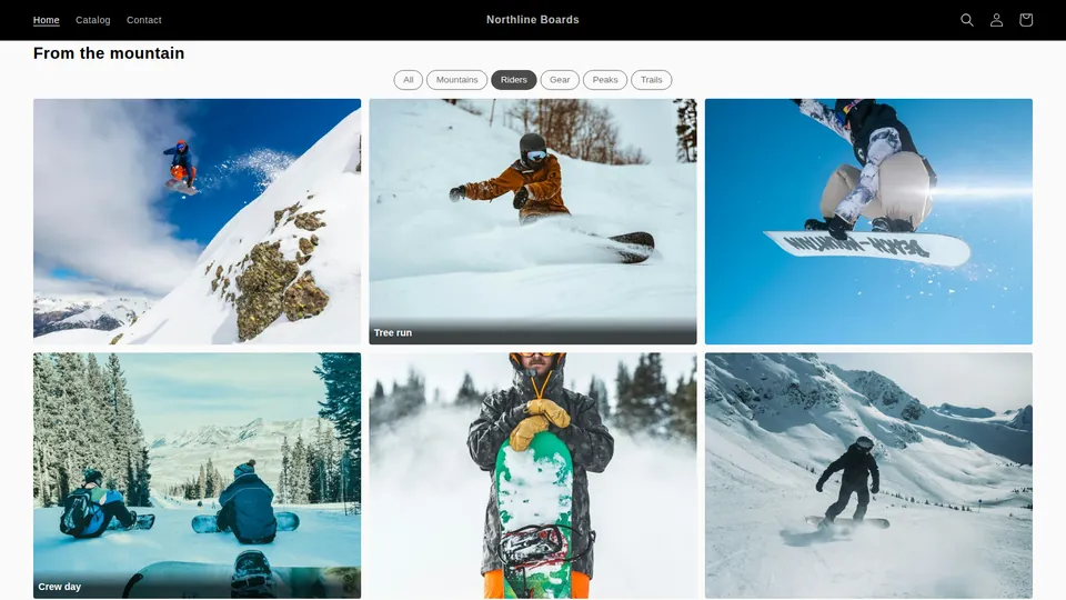
A layout for each page
- Home page: a Carousel of six to ten images, three per view, or a single Row as a divider. Keep it short; the home page's job is to send people onward.
- About or story page: List or Lookbook, so each image gets room and a paragraph. Original proportions, generous spacing.
- Portfolio, press or installations page: Portfolio with tags, or Masonry if there are no natural categories. Four columns on desktop for many small images, three for fewer larger ones.
- Campaign or launch page: Slider with autoplay off for a hero, followed by a Collage of the supporting shots.
- Product or collection page: Grid with a fixed Image shape so tiles match your product cards, two or three columns, lightbox on.
- Customer photos: Masonry, because submitted photos never share proportions, with captions on hover and submitter names on.
Changing your mind later
Because the layout is a property of the gallery and the look is a property of the block, switching from grid to masonry is a single dropdown in the editor and takes effect on every block that shows that gallery; changing columns or captions on one page only is done on that block. Nothing is re-uploaded and no theme code changes. All nine layouts and the lightbox are included on the free plan, so the quickest way to decide is to build the gallery once and preview it in three layouts in the theme editor. The setup itself is covered in How to add a photo gallery to a Shopify store (no code).
Frequently asked questions
Grid or masonry for product photos?
Grid, with a fixed Image shape, if the photos are shot on a consistent background and should line up with your product cards. Masonry if the images vary in orientation and cropping would cut off the product. You can switch the gallery between the two in the editor and compare in the theme editor preview.
What is the difference between the carousel and the slider?
Carousel shows several images per view, following the block's column settings, and scrolls with arrows. Slider shows one full-width image at a time with dots, keyboard and swipe support, and optional autoplay with a per-image interval. Use a carousel for a strip of related images and a slider for a hero.
Can I show the same photos in two layouts on different pages?
Yes. Either place the same gallery in two blocks with different column, caption and spacing settings, or create a second gallery from the same files (on Standard and above, Import from Files avoids re-uploading) and give it a different layout.
Which layouts support the tag filter bar?
Portfolio shows the filter bar by default. Grid and masonry show it when the gallery's images have tags and the block's Tag filter bar setting is not Hidden. Tags are added per image or in bulk in the editor.
Are all nine layouts available on the free plan?
Yes. The free plan includes one gallery of up to 25 images with every layout, the lightbox, captions, tags, video and hover effects. Paid plans add more galleries and images, import from Files and products, customer submissions and Shop the look pins.
More guides
- How to add a photo gallery to a Shopify store (no code)
- How to make a shoppable lookbook on Shopify
- Shopify gallery not loading? Why gallery apps vanish
- Cozy Image Gallery alternative: a 20-minute migration
- Who owns your gallery images? Shopify Files vs app-hosted
- Shopify app still charging after uninstall? What to do
- How to tell if a Shopify app is abandoned: a checklist
- Accessible Shopify image gallery: an EAA-era checklist
- Instagram feed broken on Shopify? Own your customer photos
- Shopify video gallery: upload, YouTube or Vimeo?
- Protecting gallery images on Shopify: right-click blocking
- Does a photo gallery slow down your Shopify store?
- Shopify gallery images in Google Images: an SEO guide
- Shopify Canvas and Snug Gallery: what works today
- Build a Shopify gift guide page that is not a collection
- Replaced an image in Shopify but the old one still shows?